Microsoft Power BI Desktop: A free and user friendly software programme for data visualisations in the Social Sciences
By William Lyon
11 December 2018
Scholars who work in the humanities, especially those among us who do not do much quantitative research can often be daunted by data analysis and creating complex computer-generated visualisations. Digital humanities is growing but it can seem that those involved in the field are cordoned off from researchers who do more classical analysis. What I would like to do in this short article is to focus on one tool in particular that I have used. It is simple, user friendly, free, powerful and perfect for those wishing to conduct analysis, GIS mapping and data visualisations without the daunting task of learning more advanced tools. The program I will focus on is Microsoft Power BI Desktop. To begin I will first give an overview of the aspect of my research that resulted in finding and learning how to use this tool. I will then review how I have used Microsoft BI and lastly, I will review the tool’s limitations.
I am a labour historian who currently focuses on Namibia for the period 1890-1920 and was lucky enough to come across a large set of files, 11,000 in total,collectively known as the ‘Native Estate Files.’ They hypothetically contain a file for every African labourer who died in colonial Namibia starting from 1917 up to the 1950s. I decided that I would use a portion of them, from 1917 to 1920 for my research and began the process of transcribing the data into Excel. My goal was to have enough information to extrapolate and attempt to answer questions such as: Where was the working population coming from? What were their average wages? What were the most prominent employers and industries? Where were most people working? Which family members were inheriting their estates? How were workers dying? And how many women were in the work force? Then with this information, I could complement and even expand my qualitative sources including written and photographic government, missionary and private records.
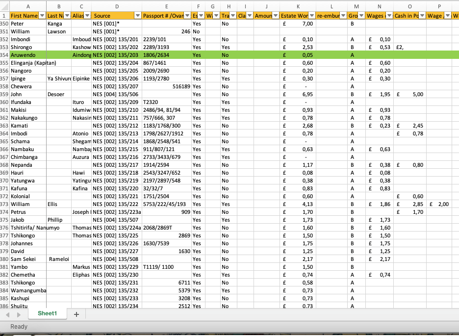
Figure 1: A screenshot of what my database in Excel looks like
The database eventually ballooned to over 1,000 workers with some very detailed information which I could not comprehend or analyse without some tools to help me. In conversations with colleagues who do data analytics, I learned about Strata , R (programming language) as well as a few other tools used by scholars in this field. Some are free and others can be rather expensive, but what concerned me was that learning many of them would take time and potentially a good amount of effort. While there is a decent chance I will learn and use such a tool in the future, for the short term I needed a tool which could help me visualise my data, but not require a large amount of exertion. At this point I was stumped and not sure exactly how to proceed.
A few weeks later, I had a conversation with a friend who works in business and he mentioned that he uses a tool called MicrosoftPower BI Desktop to get quick overviews of large data sets so that he can better use them to inform his decision making. It seemed like a potentially good solution. After researching the software, I realised that it is only available on PC and not Mac. For those of you who have a PC,downloading and starting to use the software will be no problem. For those who have a Mac, I recommend using Bootcamp, which allows you to install Windows in addition to your Mac operating system. It will not have an impact on your current operating system and only requires that you have at least 30GB extra space on your hard drive.
A few weeks later, I had a conversation with a friend who works in business and he mentioned that he uses a tool called MicrosoftPower BI Desktop to get quick overviews of large data sets so that he can better use them to inform his decision making. It seemed like a potentially good solution. After researching the software, I realised that it is only available on PC and not Mac. For those of you who have a PC,downloading and starting to use the software will be no problem. For those who have a Mac, I recommend using Bootcamp, which allows you to install Windows in addition to your Mac operating system. It will not have an impact on your current operating system and only requires that you have at least 30GB extra space on your hard drive.
Once you have a data set you would like to analyse, and you have installed Microsoft BI Desktop on your computer proceed to open the program.
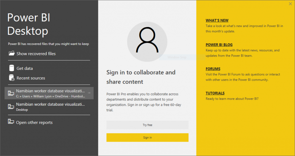
Upon opening the program,you will first need to select ‘Get data’ on the left-hand side and pick a data set. I only have experience using Excel files, but it does have the ability to pull data from other sources. For more information on what types of data are supported click here. Once you have imported your data set you will come to a screen that will allow you to begin working as indicated in the image below.
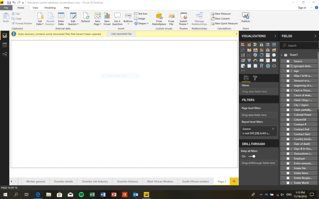
Although the work screen may look daunting, as there is so much information displayed, in reality most tasks you would be interested in will be relatively simple to execute. On the right-hand side under Fields you will see the data set(s) you have selected and imported with every row representing a separate column in your excel spreadsheet. Then to the left of the Fields section there is the Visualizations section with several icons visible, each representing a different visualisation option. To the left there will be a large open space where your rendered visualisations will be displayed. Underneath this section you will see tabs where new pages can be created,and their names can be added and edited.
What I recommend you do first is simply begin experimenting. Select a visualisation and then test pulling different data points from the fields section and placing them in the ‘drag data fields here’ box. It is essentially plug and play. Some graphs can get relatively complicated, but others are very straightforward such as pie graphs.The GIS mapping is perhaps one of the most useful visualisations as it essentially does all the work for you as long as you can provide it with a city and country name in your data set. It also has the ability to use geographic coordinates,which is particularly helpful if you are doing detailed work in regions that may not have formal names you would find on maps. If you are working on data in the United States, it can also get very granular with state and county information.
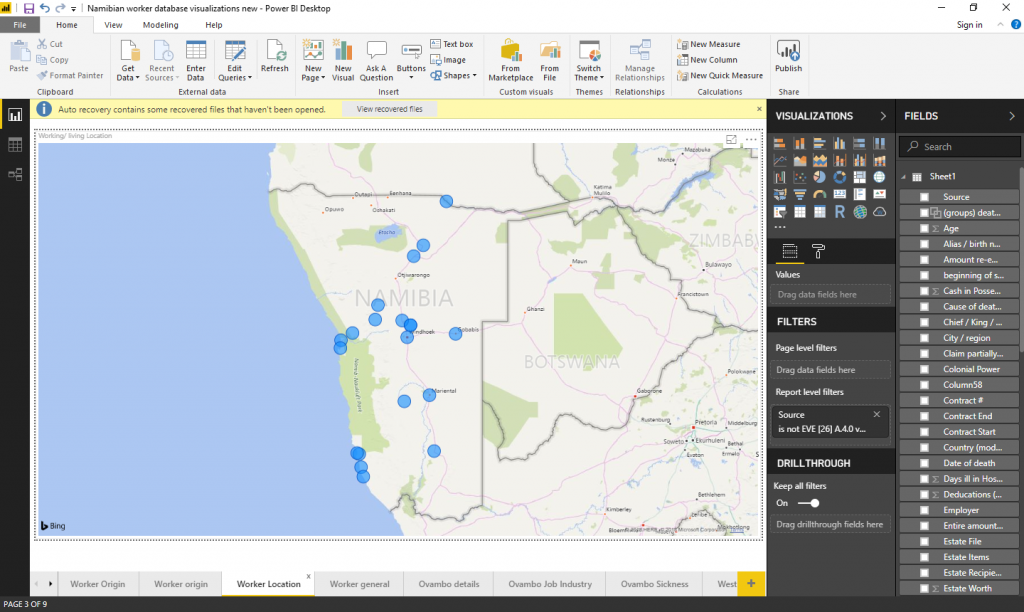
Each page can have as many visualisations as you would like and you have the ability to make graphs full screen as you can see above. What I have found to be useful if you are interested in exporting graphs and putting them for example in a presentation or in a paper,is that the images will often be too small unless you expand the visualisation to take up more space. So in practice this may mean having 3-4 visualisations on a page rather than more. For maps, it is best to have them take up the entire page as I did above or the details will be too small when you export the map.
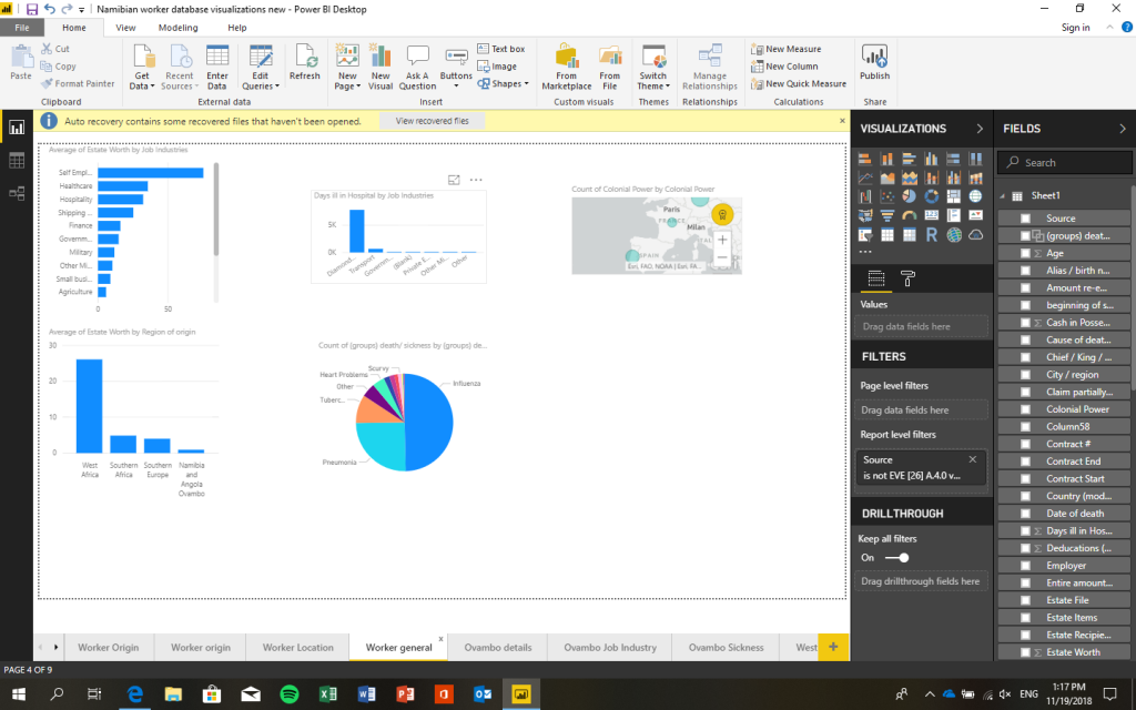
What I have found to be most useful is simply experimenting with the great variety of options available in the program. This will allow you not only to figure out different capabilities, but also help you better familiarise yourself with your data. There is also very diverse and detailed guides, information and videos available from Microsoft which cover many themes that you may find challenging.
I have used the Microsoft Power BI Desktop to better understand a very complex data set, but have yet to scratch the surface of what is actually possible. The capabilities are very robust and there are also more features available such as the ability to share and collaborate that I have yet to utilise. Whether you want to do some very quick but effective graphs or prefer to dig deeper into your data, the program seems to be capable.
I would caution that as a tool primarily for businesses, Microsoft BI is not customized for academics, but this does not adversely affect its usefulness for our field. Certain features such as the ability to export graphs directly into PowerPoint are not available for the desktop non-paying users, but in general almost all other features are accessible in the free version. It is my opinion that tools such as this can help those of us, including myself, who are not inclined to use very complex data analysis programs to take advantage of user-friendly options. This can help us to do better work and also allow academics to better integrate and analyse data sets we may normally find too complex and large.
Hopefully you have found this useful and I hope that more of us can work together with other scholars to teach and learn new skills that can bring the humanities into the 21stcentury.
About the author:
William Blakemore Lyon is a doctoral candidate in African History at the Humboldt University of Berlin. He received his MPhil in Modern European History at the University of Cambridge and BA in History at UC San Diego. He studies labour history, colonialism and migration in southern Africa. He is curious about new ways that historians can continue to modernise their field, collaborate and improve the quality of their work. You can reach him at wmblyon@me.com
